
Last week I wrote a short post about how using an X-rite ColorChecker Passport (CCP) is a really handy tool for photographers to have in their bag – especially when shooting Jpeg images as it enables you to get perfect colour corrected images right out of the camera. Today’s post is about how RAW shooters can also improve their images using the very same CCP.
What is it?
.png)
©xrite.com
Before I delve into how exactly you improve your images I thought it would be best to briefly go into what this funny pocket-sized collection of colour swatches is. The marketing blurb in the X-rite site probably sums it up best:
ColorChecker Passport Photo combines three photographic targets – Classic, White Balance and Creative Enhancement– into one pocket-sized protective case that adjusts to any scene Together with the included camera profiling and calibration software, you get the ultimate in functionality, flexibility and portability. Whether you take advantage of the entire solution, or just a couple of ColorChecker Passport’s many features, you’ll realize improved quality and productivity almost immediately
In the earlier post, we dealt with the white balance target that you could use to make sure correct white balance straight out of the camera. Today’s post is going to be dealing with both the white balance target and the classic target. I don’t ever use the Creative Enhancement target and find that I can make finer adjustments in my RAW editor of choice, Lightroom.
Why use it on RAW images?
This is often the question that people ask me, and more often than not it is being asked rhetorically.
There are a number of reasons why you would opt to use a target such as this, but for me, the most obvious reason is to achieve consistent colours across a variety of lighting conditions along with the most dynamic range in any given situation.
When editing your RAW images in software such as Lightroom, Capture One, or even Apple Photos, the software is making certain assumptions about the image when it imports it into its catalogue. These assumptions are based on lab tests the software company made with the same camera type as yours in the comfort of a studio or lab. Even when they go the extra mile and shoot sample images on site in the ‘real world’ you can’t guarantee that those conditions will match those which you work under. As an example, I remember taking some photos of Stonehenge in the middle of winter. The lighting and conditions at 11 am (when we were able to get there) where much the same as the winter conditions in Durban, South Africa, at 6:30 am. Needless to say, the soft contrast and gentle colour gradations Northern Europeans experience in the 30 minutes or so after sunrise, we get for about 30 seconds after sunrise
Another thing you may have noticed is that when an image has been imported into Lightroom you can cycle through a selection of camera profiles that come built into Lightroom. There are few Adobe ‘generic’ profiles, and then there are profiles that Adobe has created to try and match your Camera manufacturers Jpeg profiles found on your camera. By cycling through these profiles you will notice your image change – and often by a fair amount. Changing the camera profile can not only alter your image’s colour, but it also affects the contrast as well as the highlight and shadow detail.
The changing colour of the image never really bothered me. The differences between the profiles are much the same as the differences between film stocks back when shooting on film. You would still achieve ‘correct’ colour, but there would be a slightly different feel to the image. What bothers me are the swings in the contrast and the highlight and shadow detail between the different profiles. Where I stay things can be quite contrasty, especially in summer, and I never wanted to leave any dynamic range on the table. This is where creating your own custom profiles comes into the mix as you can get consistent colour with every image whilst also getting the largest dynamic range out of any given scenario.
*Side Note: When did exposure latitude become dynamic range? I must have missed that meeting!
Are there added benefits?
Sure! I have also noticed that since creating my custom profiles for each lighting scene that presets are now far more consistent than they were before. In the past, a preset could change the appearance of one image a lot whilst having a much smaller effect on a different image. How many times have you heard someone online saying, “this preset is only good for these images but it doesn’t work well on other images”? I am convinced that a lot of the problem is because photographers aren’t working off a consistent base.
Whilst it does take a few seconds to create the profile in Lightroom, or in the standalone software that comes with the CCP, I have found that there is a big time-saving, especially with larger shoots like weddings.
Can it be used with Capture One?
Sort of! As of writing this ColorChecker Camera Calibration v 1.2 had just entered public beta testing. Here is a snippet from the X-rite press release:
X-Rite Announces Public Beta Release of ICC Camera Profiling Software
ColorChecker Camera Calibration Software v1.2 provides custom ICC Camera Profiles for Capture One Pro Users
So it is sort of here but is in public beta so there will still be some things to iron out and results may not be as consistent as you like. If you already have a CCP and are using Capture One then I would say you should definitely give it a try. If you don’t own one yet then perhaps wait for it to come out of public beta testing or see if you can borrow one from a friend to try before you buy.
What types of profiles can you create?
There are two types of profiles that you can create using the CCP, although only one can be created directly in Lightroom.
The first type, and it is the one that I exclusively use, is the DNG profile. This can be created in Lightroom and is the more exact of the two options as it is a profile created for a specific lighting condition. If you change locations or lighting, or if you notice the ambient lighting changing, then you should ideally create a new profile.
Most manufacturers offer standard profiles with their cameras, and your Raw processing software may even offer a profile for your exact model. But if you are looking for true, accurate color, you need to create a custom profile based on the Raw output from your camera in your shooting conditions.
Although it is possible to get the color you want through custom image editing, the faster, easier and more consistent method is to start with good color from a custom profile; then apply your subjective edits.
The second option is called a Dual Illuminant DNG. This uses two reference images, shot under different lighting, to create a more generic camera profile. It will be less accurate than the standard DNG profile, but it can be a good option to create one of these to have for emergencies (when you forget your CCP at home). Unlike the DNG profile, you can’t create the Dual Illuminant DNG in Lightroom and must use the software that comes with the CCP.
When you are photographing a scene with distinctive lighting, creating a custom DNG Camera Profile is recommended. However, when you are shooting in routine lighting conditions, such as in sunlight or in a room with fluorescent bulbs, a Dual Illuminant DNG Profile can give a flexible standard baseline, which you can apply to your images. Dual Illuminant DNG Profiles give assurance that you can achieve consistent color when shooting in a broad variety of lighting conditions…..
…..For example, if you are a wedding photographer who regularly photographs events in the big church downtown, you can create a profile that includes the lighting in the church, plus daylight conditions in the garden outside. This adaptive profile will work well in both settings, as well as a variety of other lighting conditions, so you can concentrate on getting fabulous photos of the wedding couple.
Creating a DNG profile
- Open an image of the ColorChecker Classic in the Camera Raw plug-in.
- Don’t edit the image, but make sure to verify that it was exposed properly.
- Save the image/s as a DNG so you can open it in the ColorChecker Passport Desktop Application.
- Click the ‘Save Image’ button in the lower left corner. A new window will appear.
- In the ‘Format’ drop-down, specify DNG by selecting ‘Digital Negative’.
- Click ‘Save’.
- Launch the ColorChecker Passport Desktop Application.
- Select the DNG tab and drag and drop the DNG file into the window.
- Click the Create Profile button. The software will automatically search for the patches and build the profile. If the software cannot find the patches, you will be asked to manually find the corners of the patches.
- Give the profile a meaningful name that describes the lighting conditions and click Save. By default, it will be saved to a directory that Photoshop, Photoshop Elements and Lightroom use to store DNG profiles.
- Restart your Adobe applications to use the new DNG profile. It will be available in the Camera Calibration panel in Lightroom and Camera Raw. In newer versions of Lightroom, the camera profiles have moved to the top under the Basics tab.
- In Camera Raw, open an image and click on the Camera icon to see the Camera Calibration tab.
- From the pull-down, select the new profile.
Remember to only delete profiles that you are not using, or have never used before. If you delete a profile that is in use it will affect your previous edits and Adobe will most likely apply the generic Adobe Camera profile.
Samples
I have put together the below samples showing some differences between images using the Adobe Standard profile, the Adobe Fuji X-T1 ‘Provia’ profile, and custom ColorChecker Passport profile.
I have made no other changes to the images – only the profile is different.
Lastly, to see the differences you may need to turn on colour management for whichever web browser you are using. Some browsers have this turned off by default. Safari is probably the best purely because everything is set by default. Firefox isn’t bad either and Chrome is better than it was before. Again, if you don’t see any difference then you need to either check your settings or try another browser.

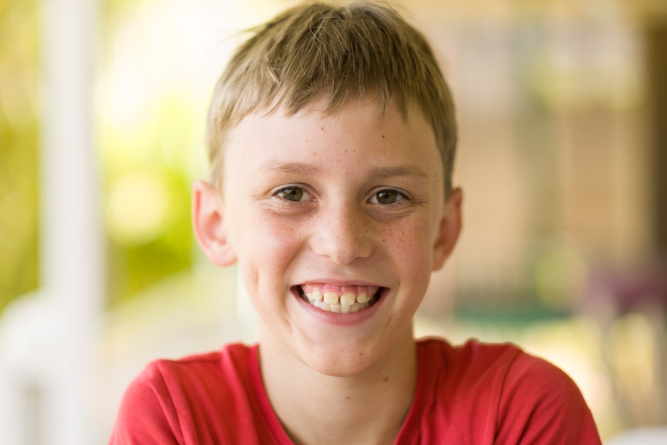
In the above sample, you can see the Adobe Standard profile on the left with the custom profile on the right. There is a slight difference in the colour and a lot of the red in the skin tones has been removed. Below we will now compare the Adobe FujiFilm Provia profile with the Custom Profile.

Again, the red skin has been toned down, but there is now also a larger difference in the contrast and shadow areas.

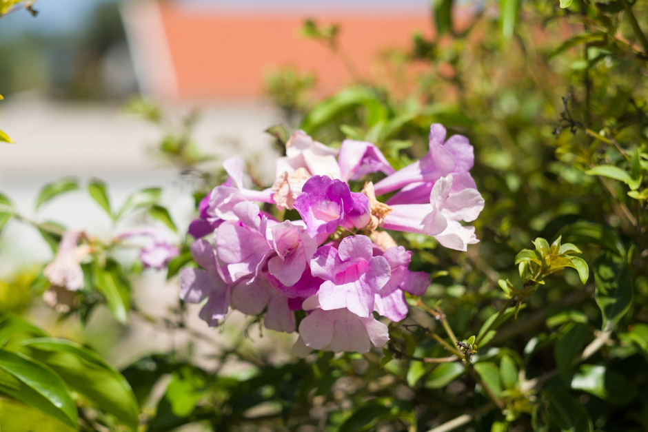
In the above sample, you can now see a much larger difference in the colours of the flowers. The custom profile is far more accurate even though both images are using the exact same white balance. There is also a slight difference in the green leaves, with the ones in the custom profile being more accurate once again.

Again we have the custom profile is compared to the FujiFilm Provia profile supplied by Adobe. The colours are more accurate, but in this image, you can see that the custom profile also has less contrast and slightly more detail in the shadows.


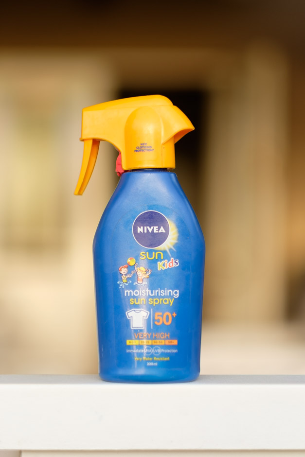
This image again shows a considerable difference between the standard Adobe profile and the custom profile created with the ColorChecker Passport. The blue of the bottle is slightly more saturated and the orange top is far closer to how it looks in reality. The Adobe profile looks a little washed out in comparison.
Another comparison between the custom profile on the right and the Adobe supplied FujiFilm Provia profile.
Conclusion
In all of the images above, I prefer the custom profile created by the ColorChecker Passport. They are all much closer to how the scene looked and give you a little more room to tweak the contrast to how you would like it. Whilst there are other FujiFilm simulations created by Adobe to try and match the in-camera film simulations I have always found the custom profiles I create to be that little more accurate, and as I alluded to above, I just prefer the finer control I have of the images contrast and shadow detail.
One thing that I was slightly surprised about is that I probably prefer the Adobe standard profiles over the FujiFilm simulations. We all rejoiced when Lightroom started providing FujiFilm film simulations, but I think that recently Adobe has done a pretty good job with their own profiles. There are now also other Adobe profiles which gives you a few more options.
Lastly, I created a dual Illuminant DNG profile for the X-T1 and was surprised just how close it was to all the custom profiles. For years I had written them off as being nowhere near as accurate, and perhaps at one stage this was the case, but I found the results to be so close that I think I am going to create a few ‘general purpose’ profiles to use for those occasions where I never had my ColorChecker Passport with me. Here is one example – see if you can tell which was the custom profile and which was the dual illuminant profile:

That is almost exactly the same! I can only really see any difference in Photoshop and by the time it is downsized and compressed for the web it is pretty impossible to tell. With profile creation being so quick I will most likely continue making custom profiles, but It will be good to have some better quality general profiles to use in emergencies.
For me, the improvement in colour accuracy, the slightly ‘flatter’ image, and the increase in shadow and highlight detail seal the deal. There are often situations where you struggle to hold detail in the highlights/shadows and it isn’t helped by the fact that many profiles are leaving some of the Shadow/highlight detail on the table. I always prefer smaller adjustments to an image and I’m able to make smaller adjustments when using a custom profile. I like having what almost looks, at times anyway, like a Log profile that gives me more creative freedom when applying filters or when making standard edit.
If you have any questions or thoughts regarding the above please feel free to drop me a question/comment in the comments below.
If you would like to try the dual illuminant profile for your X-T1 you can download it from here